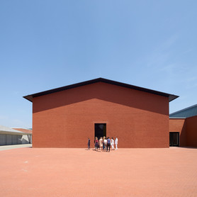
The exhibition’s scope
Marking the centenary of Panton’s birth, the exhibition brings together furniture, lighting, textiles and architectural ideas. The museum describes a walk-in reconstruction of his 1970 Fantasy Landscape and a coloured ribbon through the Schaudepot. This note draws on the museum’s release; it is not a first-hand exhibition review.
Our studio take: test the colour in its setting
A colour can appear different on a coated label, an uncoated card and a translucent panel. Add ambient light, nearby surfaces and viewing distance, and the same artwork can produce several visual experiences.
For a launch or installation, put material samples beside each other under the intended lighting. Include a full-size patch of colour and a section of actual typography. Review the relationship between surfaces before extending the design across the whole space.
Make repetition purposeful
A consistent palette does not require every surface to do the same job. A broad field can establish atmosphere, a contrasting sign can direct movement and a small printed card can carry detail. Plan those roles together so the visitor recognises one coherent identity.
Sources
Vitra Design Museum — Verner Panton: Form, Colour, Space ↗
Exhibition May 23, 2026–May 9, 2027; checked October 6, 2026. Catch-up note for September 30; added October 6.